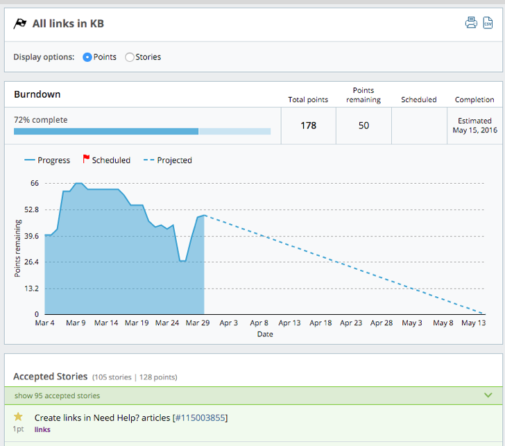
The Burndown chart displays the number of points (by day) remaining in a release. It indicates how the team is progressing (i.e., “burning down”) toward a release target.

Traditional burndowns show the entire point scope on Day 1 of the release. Tracker’s Burndown chart goes further by showing when points were added (i.e., scope increased). The release has a bar showing its progress towards completion.
There are several things you can do with this chart:
-
Gain release date confidence (scheduled vs. actual). In-progress releases show the projected completion date. This is calculated based on your project’s average velocity. If you have a release story with a scheduled deadline, the Burndown chart will project to this (with a dotted line) as well. This gives you a level of confidence about when a release will likely be done based on the team’s cadence.
-
Examine scope increases. Scope changes are incorporated as a part of the burndown line, so it’s easier to identify when new scope was added to a release and how it may affect completion.
-
Gauge prior release performance. Tracker keeps snapshots of historical data for the state of your project’s stories over time. This means that you can backtrack to prior releases and see how they went. Comparing burndown patterns of old releases to current ones helps predict how a new release might play out.
Using this report
Click Releases & Burndowns in the Analytics sidebar, then click view burndown to the right of any release’s name.
Mouse over any section of the chart to display the points remaining on each date.
If you selected the Show Stories display option on the Releases report, that setting carries over to the Burndown chart. After selecting the Show Points display option, the progress bar, burndown and counts will change to show point totals instead of story counts.
Mouse over initials to see someone’s full name, and click the story ID to open the full-page view of that story.