Experience “Projections”, an instrumental Analytical Tracker utility
Backlog refinement is a regular task for any Product Manager using Tracker. Planning work and translating it into smaller incremental prioritized stories is an essential task for refining the backlog appropriately.
When we released Projections Beta version , we made sure that this utility helps you to visualize your scope, current progress and realistic forecasting considering any inherent uncertainties your project has.
Did you subscribe to the beta release and get a chance to experience Tracker’s Projections feature? If not, we are releasing this instrumental analytical utility for all Tracker users so that you can experience this feature with its full capabilities.
During the beta period, we learned that even though Tracker is highly opinionated, Tracker users have been using Tracker liberally in their contexts and hence the projections chart will help you to visualize the pitfalls where you may need to pay extra attention. How does this work? Let’s explore it together now.
Summary of Projections visualization
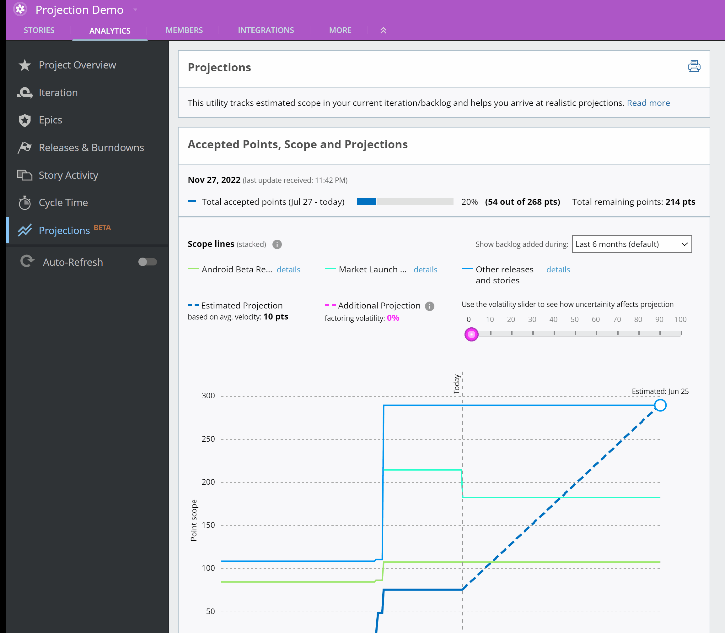
The Projection visualization shows time on the X-axis and Estimated Point Scope on the Y-axis. It consists of the following curves/lines:
- The Scope lines represent the estimated scope in the Current iteration/Backlog panel grouped by release markers.
- The Total Accepted Points line represents how many points have been accepted historically until today. This line is updated dynamically as your team accepts the stories.
- The Estimated Projection line represents the forecasted ideal progress that can be made based on a team’s running average velocity. This line does not consider any impact of Volatility (variability caused due to velocity fluctuations). This line will consider and show the impact of changing team strength for future iterations, if any.
- The Additional Projection line represents the forecasted progress that can be made considering volatility. Factoring in volatility takes care of additional uncertainties like scope creep, estimation accuracy, unplanned capacity drops, delays due to any known or unknown technical constraints, etc. This line will also consider and show the impact of changing team strength for future iterations, if any.
Projections Chart Demo Video
(Click to zoom)
Best practices to follow
Below are a few tips and reference articles for adopting best practices to make the best utilization of the Projections chart utility.
- If you happen to see your backlog growing bigger and bigger then Projections, visualization may overwhelm you and your teams. It’s a sign to tackle the epic problem of a stale backlog. You will not be able to see visualization for any stories that are added and estimated 1 year from the current date. Tracker recommends keeping your backlog active and healthy. Doing big bang planning and estimating stories in bulk is an antipattern to active backlog refinement.
- Are you injecting a depth to your backlog? Try grouping stories to product areas, goals or milestones. You can easily talk about accomplishing a high ROI by feature slicing so that instead of injecting depth to your backlog you have a width of backlog that has high value stories grouped together. (Tracker tip: consider giving all the stories for a milestone or release, including the marker, the same label. This eases search and conversion to a label later).
- Make sure you add only validated, high value, prioritized stories to the backlog and keep the rest in the Iceboxl. We recommend that all team members have access to one shared backlog, and that they work their way down this prioritized list from top to bottom.
- If you are a new Tracker user and the concept of velocity and volatility is daunting to decode then I encourage you to read this article for better understanding.
- Realistic Planning is a facade if you are struggling to refine your backlog accurately. Read this article to accurately refine a backlog without falling behind or getting into the trap of big bang planning.
- Projections is not intended to be a utility to visualize your high level estimates (which you might be carving out through a Roadmap). Instead, it’s a utility to help gauge your well refined, estimated backlog and show a realistic visualization of scope, estimated and projected timelines based on the ongoing progress of your team. Read this article to differentiate between high level planning vs granular planning for better clarity.
What will change since we released the Beta version
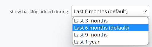
- Projections will have the capability to select a time range so that you can narrow down the visualization for a periodic timeline.
- If your project backlog has estimated stories that were added to the backlog over one year back then you will be notified that you have a high risk of introducing backlog depth.

- If there is high uncertainty (i.e. volatility is >= 100%), that means it is quite unrealistic to forecast, therefore the Additional Projection line will not be intersecting with the Scope lines and you will not be able to see projected timelines for any scope lines.
What’s coming next…??
Today the Scope lines are stacked above the Total Accepted Points line due to the inherent technical complexities associated with the stacked graph. We are refining this idea further and eager to know how well it is working with you.
We hope that the Projections Chart will add value to your planning, help you communicate realistic timelines to your stakeholders, and be an instrumental utility to help you refine backlog realistically and drive meaningful, action-oriented discussions.
As always, please don’t hesitate to share your feedback by emailing us at support@pivotaltracker.com or by selecting Provide Feedback under the HELP menu in Tracker. We love hearing from you!
–The Tracker Team–