Tracker Analytics are designed to help you see what’s being worked on, how things are progressing, and where your team might need help. Tracker Analytics reports and metrics not only show the high-level progress on your work —- allowing you to manage scope creep and identify bottlenecks —- but also let you filter and drill down into specific stories, epics, and iterations.
By default, Tracker automatically moves stories to and from the Current iteration based on the number of stories planned, their estimated points, and the project’s current velocity. You can already see estimated completion dates for releases individually through Release reports and Burndown charts. Several customers expressed their interest to visualize all estimated scope in one view, see how the scope has evolved over time, and then be able to figure out how predictably their teams can burn that scope over a period of time.
Today, some of these users rely on spreadsheets and other external tools to create such desired data and visualize expected progress. While exploring this idea, the Tracker team acknowledged that, apart from the velocity-based estimations, Tracker does show volatility in some reports but there’s no capability to visualize the impact of volatility on estimated completion date. The feedback we heard was, “How do we use velocity, volatility, and release markers to show when we might reach those markers, but also make it clear how much uncertainty there was around that?”
With this notion in mind, we inquired and ideated with Tracker users and have come up with Projections in Tracker Analytics. Projections is an extension of the existing velocity-based estimation data to accommodate the impact of volatility on work completion.
A volatility-based projection is likely to give a more realistic time window in which teams are likely to complete the planned estimated work. What also helps is seeing the total scope for various releases in one single view so that you can reprioritize or reduce scope for a certain release if it’s not likely to be finished by a scheduled date. This visualization will be particularly useful for time-sensitive releases, helping teams immediately figure out how to reprioritize such scope with confidence.
Projections will also consider the impact of changes in team strength during current/upcoming iterations.
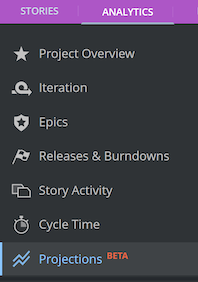
Let’s look at the information shown on the Projections visualization.
The Projections utility is available on the Analytics page. The Projection visualization shows time on the X-axis and Estimated Point Scope on the Y-axis. It consists of the following curves/lines:
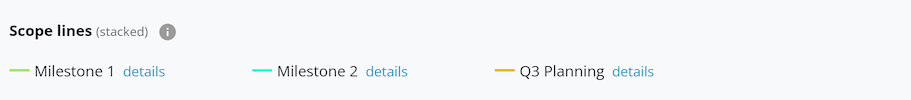
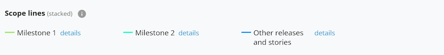
Scope lines represent the estimated scope in the Current iteration/Backlog panel grouped by release markers.
You may use this section to understand how Scope lines are plotted on the Projection graph and it doesn’t indicate that you have to keep any specific number of Scope lines in your Current/Backlog panel. Tracker encourages you to plan realistically and be mindful of not injecting stories and estimating in bulk. Estimating in bulk and ahead of time (e.g., more than two iterations worth of effort) may cause Backlog depth and may therefore prompt your team to add inaccurate estimates to your planned stories. (Refer to the legends as shown below for a better understanding of the different possible scenarios.)

The Total Accepted Points line represents how many points have been accepted historically until today. This line is updated dynamically as your team accepts the stories.
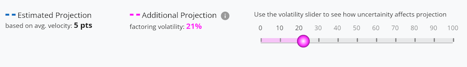
The Estimated Projection line represents the forecasted ideal progress that can be made based on a team’s running average velocity. This line does not consider any impact of Volatility (variability caused due to velocity fluctuations). This line will consider and show the impact of changing team strength for future iterations, if any.
The Additional Projection line represents the forecasted progress that can be made considering volatility. Factoring in volatility takes care of additional uncertainties like scope creep, estimation accuracy, unplanned capacity drops, delays due to any known or unknown technical constraints, etc. This line will also consider and show the impact of changing team strength for future iterations, if any.
The volatility variation entails inherent relationship with changing timelines, therefore Additional Projections can be used to express how increasing / decreasing volatility can change the Projected timelines for a planned scope. The Additional Projection line is preset at the existing volatility and users are free to use the slider to see how increasing or decreasing the volatility can affect the scheduled release dates.
It’s worth noting that a release is likely to get completed at a point where the Projection lines intersect the release Scope lines. If a release has a scheduled completion date, a colored flag is placed on that date on the X-axis. If the release is not completed by the scheduled date, the flag turns red.
(Click to zoom)
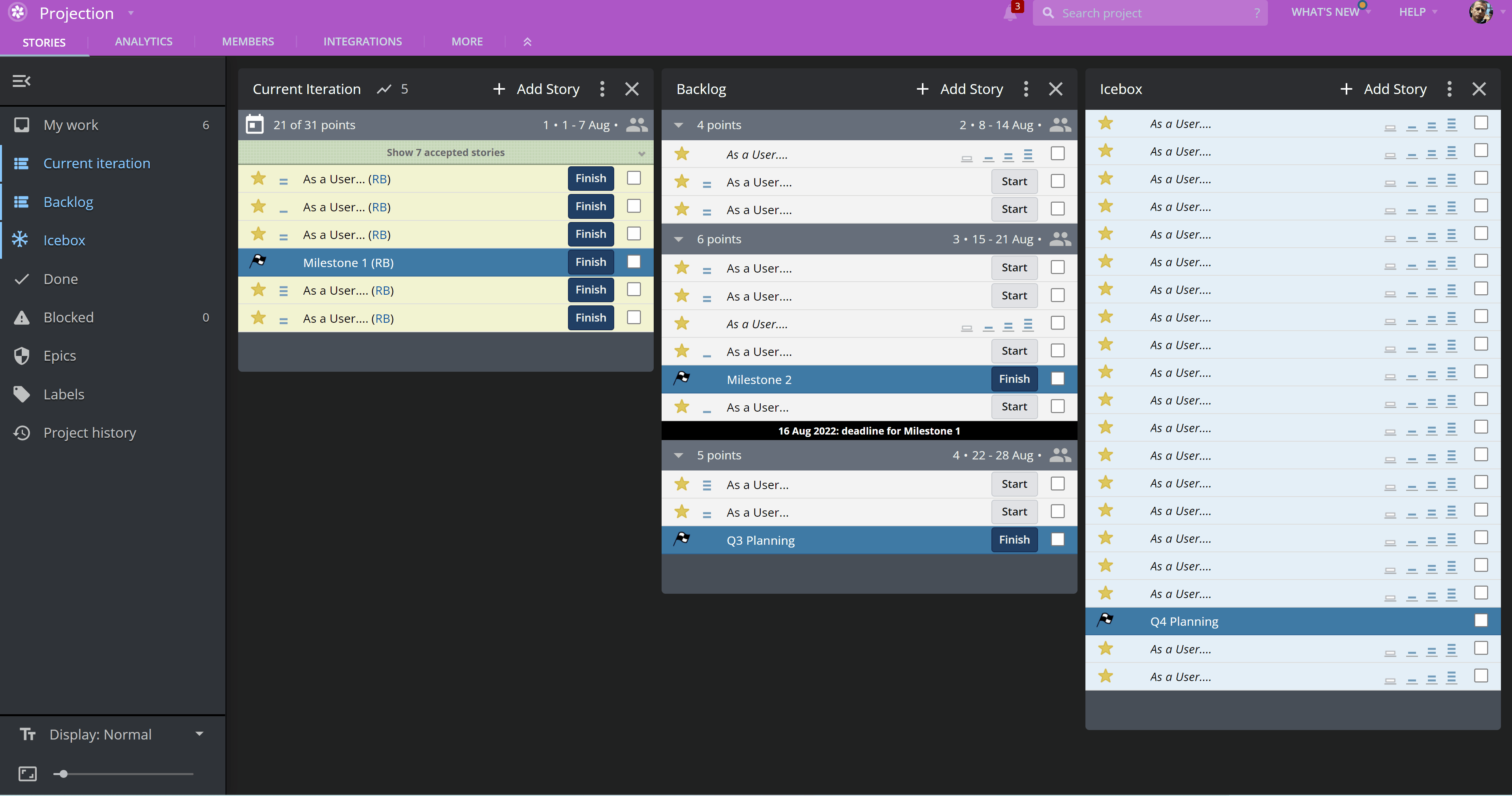
Release markers are used to plan milestones/releases and group the stories.
You can organize your releases in such a way that helps you make the right decisions in terms of planning and prioritizing high-value features based on your team’s capacity. Check this Help page if you’re interested to explore more on how to organize your releases.
Projections will help you project the time required to complete the planned scope (usually grouped using release markers).
You can choose to create release markers or simply plan your estimated stories and get a sense of when some planned estimated work is likely to be completed. You’d be in a better position to adjust and prioritize scope based on the projections shown.
(Note: This section is applicable only if you intend to track stories via release markers.)
During the software development lifecycle, we’ve observed that teams pick the top prioritized stories from the group of releases if multiple tracks of work are planned to start in parallel. In such cases, the stories will move on top from various release groups into the Current iteration panel. This will lead to a mix of stories coming from multiple planned release groups from the Icebox panel.
Today, release markers act as a way to group stories. When stories belonging to different markers get picked up by your team members, it’s likely that you’ll see a mix of work from different tracks in your current iteration. This will slightly alter the Projections Chart compared to the planning stage. Therefore, it’s recommended that you create mini markers to segregate ongoing work from the planned work in your backlog.
There’s a lot we expect to learn from the beta release of the Projections Chart. We’re interested to see how you’ll be using this feature and what use cases this feature will fulfill. We’re aware of the limitation of no direct association of release markers with grouped stories. In the future, we plan to apply our feedback loop learning to build new features or refine existing ideas. Here are some cool ideas we’re still working on validating.
Visualizing scope using outcomes: We learned from our users that they’re interested in visualizing a capability in Tracker in tying work to an outcome. So we believe that you might explore the release marker stories to categorize total scope by outcome labels (special labels that can express business outcome) so that you continue to see the projections for various business outcomes no matter whether you group the prioritized stories under one release marker/more. As soon as your team starts working on prioritized stories (labeled with the outcome you want to track), you can track the progress and derive projections against a label.
Probability of success: Based on the estimated and projected dates, we plan to show success probability to meet schedule timelines so that you can plan accordingly, prioritizing or deprioritizing your scope and engaging the right stakeholders to have a meaningful discussion.
Feedback loop: We’d like to see how our users can partner in this journey by tracking their historical and current projections and sharing their feedback on the accuracy, what works, and what doesn’t work.
Recommendation engine: This is a data-driven utility that can share suggestions to help you successfully identify and mitigate potential issues/blockers that are slowing down your team and jeopardizing your plans to deliver value to your customers faster.
We hope that the Projections Chart will add value to your planning, help you communicate realistic timelines to your stakeholders, and be an instrumental utility to drive meaningful, action-oriented discussions.
If you wish to subscribe to our Beta release program, want to explore the Projections Chart and be part of the journey to refine this cool feature, then please feel free to reach out to us. As always, please don’t hesitate to share your feedback by emailing us at support@pivotaltracker.com or by selecting Provide Feedback under the HELP menu in Tracker. We love hearing from you!
–The Tracker Team–