
Of all of our customer requests, improved reporting and analytics is one of the most popular, consistently ranking near the top of the most requested features on our marketing and exit surveys.
Until recently, we hadn’t taken the time to focus on improving our analytics. The biggest reason for this is that we didn’t really use any project health metrics ourselves. Our team was small, we didn’t ever really “report to anyone,” and we don’t really have hard deadlines. This isn’t to say that we couldn’t benefit from project health metrics; we just hadn’t experienced a strong need for them, so we had difficulty addressing a need we couldn’t identify.
The obvious answer was to also speak to customers and Pivotal Labs consultants (aka, “Pivots”). But who, and how do we find them?
Our first step was to go to customers and Pivots already using our reports. The goal here was not only to discover how they were using reports now, and what was valuable to them, but also learn what other reports they create (with or without Tracker data). While a good starting point, this can be a risky undertaking to only speak to current customers. The concept of a “product death cycle” illustrates that simply speaking to your current customers does not reveal the needs of those who don’t use it now.
The second group we spoke to included people who mentioned reporting, dashboards, and charts in feature requests and marketing surveys. These represent an underserved group who were not finding value from our current reports. In many cases, they were using other tools (or creating their own tools) to compensate.
The third group was customers and Pivots who were managing larger teams that didn’t necessarily ask for analytics, but had a depth of experience on various engagements. For this group, we wanted to know which metrics were most important to them to track team progress in general. The reason we looked at larger customers is because we found a correlation between larger teams/multiple projects and a greater need for holistic views of projects, as their size makes them difficult to manage directly.
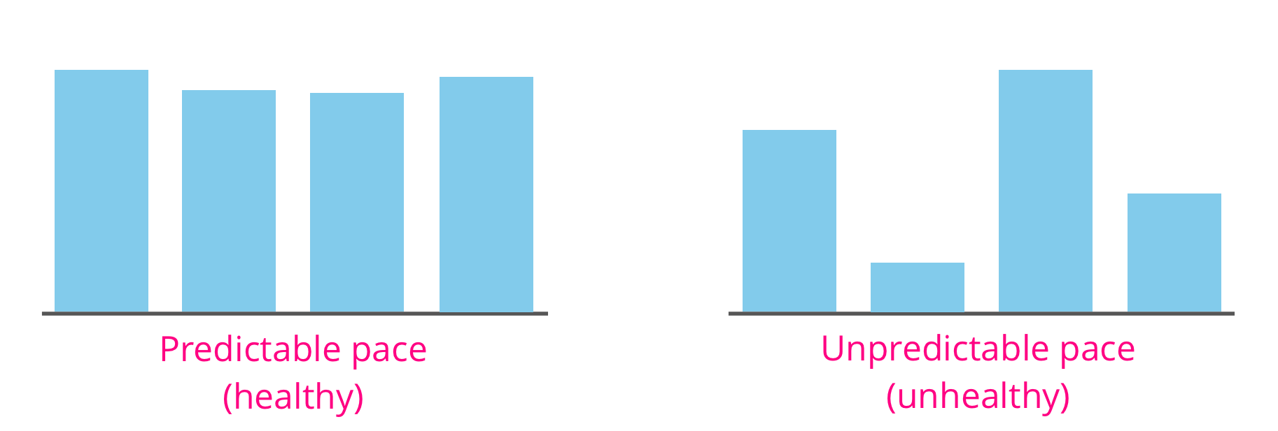
We’ve been hearing for some time that experienced PMs focus less on the speed of the team and more on predictability. This is because predictability is about confidence: it allows someone a better idea of when something might be done, and with fewer surprises along the way. When we spoke to experienced PMs—particularly Pivots—a number of recurring factors for measuring predictability kept emerging:
Velocity and points accepted is often the first (and sometimes only) metric that PMs pay attention to. But instead of just looking at the velocity numbers in isolation, experienced PMs track trends in velocity over time for signs of peaks and valleys, known as volatility. We have a metric we use for volatility in Tracker, but this number alone might not tell you as much as visualizing these trends on a graph. Ken Mayer wrote about the importance of paying attention to volatility on our blog a few years back.
This includes any stories that may be blocked, or which are not moving through the delivery process as expected. A common problem is a situation in which the team has delivered a number of stories but those stories have not been accepted/rejected, leading to a situation colloquially known as “Christmas time,” due to the red/green button coloring on the dashboard. Another common issue is having too many stories started without being delivered (aka, “too many balls in the air”). Experienced PMs look for these patterns frequently to get a sense of ongoing project health.
For planning purposes, Agile discourages pegging time to story work (or points). This is because it skews team estimation of work away from complexity and toward time. But knowing how long it takes to typically get work done is an asset to a PM trying to identify process bottlenecks, or planning for several iterations out.
Closely tied to completion time is rejection rate. PMs reported that they would look for trends in rejection; too many rejections for a particular iteration were a warning sign. Rejections can mean a number of things that can point to a process bottleneck: loosely defined acceptance criteria, steps being missed, or misunderstood story requirements.
Note: All of these report examples were recreated from customer and Pivotal reports formats. The project names and content have been changed to protect privacy.
In another post, I wrote about the importance of using artifact research to get to customer pains quickly, tease out needs vs. wants, and demonstrate value to stakeholders. I won’t go into depth about it in this post, but most of our insights about customer reporting needs came from looking at what customers were doing already.
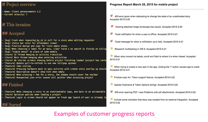
One report we encountered early on was a basic progress report. This was something that seemed ubiquitous across customers and Pivots. The format of the report was straightforward, showing what the team accomplished in some period of time (usually an iteration) and what was still in progress. These reports may have also included some notion of what was coming down the pipeline the next iteration. In all cases, the progress reports used stories as a basic unit of accomplishment.
Below are two examples of this report: one from a Pivotal Labs PM, another from a customer. Both are creating roundups of stories accepted, with the darker version (a Markdown file) demonstrating what was also in-flight and unstarted.
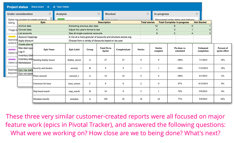
Most of our customers (and Pivots) use epics to represent major feature areas. This makes sense considering that epics basically represent large features. Many teams will also version their epics to demonstrate their place in a bigger roadmap (e.g., “Login screen v1,” “Shopping cart v2,” etc.).
To this end, epic progress reports were one of the most common reports we saw. This took many forms, but the most common was that of a report each iteration with the recently completed, in-progress, and upcoming epics. The degree of details varied between reports, but the constant was knowing which epics were completed, which epics were in progress (and what was left from those epics), and what was coming down the pipeline.
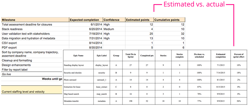
Customers would frequently tell us that they wanted to see what they planned to do vs. what they actually accomplished. This closely follows the theme of predictability, as it gives PMs a sense of what may happen in the future based on what happened in the past. More importantly, it allows PMs to identify problems with their process.
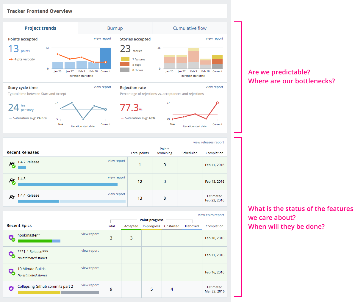
There was a lot we wanted to do with Tracker Analytics, but for the first version, we kept things simple and focused on the most basic form of the above indicators. We designed Analytics to help teams clear process bottlenecks, stay predictable, and communicate status. We wanted to help PMs answer these questions:
Lisa Doan wrote a great post on the basic usage of Analytics. In the article, she talks about using Analytics to make teams more predictable, identify bottlenecks, and report on feature work.
How are the new Analytics working for your team? Let us know by using the Send us feedback widget in the top left of Analytics, or email us.
Category: Productivity
Tags: Analytics