
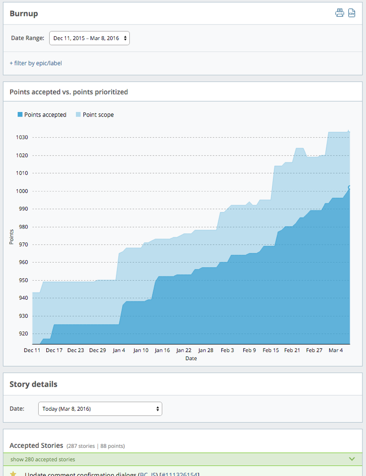
The Burnup chart is a simple measure of progress for an iteration or project. It shows the total number of accepted story points vs. the total number of prioritized points. Cumulative Flow is the same kind of chart with more states visible.
There are several things you can do this chart:
-
Track progress. Accepted points are shown in conjunction with point scope to indicate progress toward scope completion. Ideally, accepted points are on a trajectory to equal the point scope, indicating steady progress.
-
Manage scope. Point scope can indicate an increase or decrease in project scope, which may impact the team’s ability to meet a goal.
Using this report
Click the Burnup tab on the Project Overview chart, then click view report to select the date range and filtering options for the report.
Choose different time periods with the following Date Range menu items:
-
Past 14 days
-
Past 30 days
-
Past three months
-
Custom date range (within the last six months)
When you first view the chart, it defaults to the past 90 days.
To see the data for just an epic or label, click + filter by epic/label, type the first few letters of the epic or label name, and then select the one you want. One epic/label filter can be applied at a time, allowing you to drill down into a specific feature.
Mouse over the chart to reveal the number of points accepted and scoped on each date.
To see story activity for any day within the last six months, choose a Date for the Story Details report.
Mouse over initials to see someone’s full name, and click the story ID to open the full-page view of that story.